Michael Moorcock, circa 1963 (photo taken from here).
![]()
With a career now spanning over 50 years, Michael Moorcock (born in London in 1939) is indefinable. A SF writer who set on a mission to turn SF on its head and who had little respect for its Golden Age ‘pantheon’, or a pulp writer who nevertheless, through the sheer refinement of his prose, made it to the The Times‘ 2008 list of “The 50 greatest British writers since 1945”? A core Londoner who wrote one of the best literary hymns to the city, Mother London, and yet feels at home in either Texas or Paris? A hugely read, cultivated, cerebral man of letters who made close friends and collaborators among Pop and comic book artists, and who mingled and performed with hard rock bands? James Cawthorn, one of the many artists he worked with, created in 1979 a dual portrait of Moorcock as the fin de siècle dandy aesthete and the wordage-obsessed barbarian, but one feels that there are at least five or more panels missing in that diptych.
![]()
Moorcock’s two sides: The Aesthetic and The Apocalyptic
(drawn by James Cawthorn in 1979).
![]()
I decided to contact him for this interview after my curiosity over his relationship with J.G. Ballard and their work at New Worlds magazine (of which Moorcock was editor before he was 30) lead me to read Colin Greenland’s 1980 essay The Entropy Exhibition, a neatly designed volume addressing the so called “New Wave” of British SF. I followed that with Death is no Obstacle, a series of interviews by Greenland, published by the Mancunian survivors Savoy Books, in which Moorcock’s astounding erudition and clear thoughts on his legendary writing (and editing) methods get under the spotlight. But both books somehow came up short in what concerned the visual side of his career (which has hardly been contained to the written word), the graphic flair of New Worlds alone (especially in the period of 1967-1971) serving as example that perhaps more could be unveiled or at least probed into.
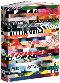
These (perhaps too long and wordy) questions caught him jet-lagging in Paris after a flight from Texas, “distracted in finishing a book” and perhaps with some curiosity over the releasing this month of Savoy’s mammoth (and exquisitely designed by John Coulthart) Into the Media Web, a 700-plus pages volume collecting Moorcock’s non fiction writings. That he has still managed to come back with answers that are as revealing as they are precise, considering some of these facts and people belong to a now distant era, is a proof of the accessibility and worldliness of this legendary writer.
A 50-year long ride: Savoy Books’ Into the Media Web, due to be released this month (design: John Coulthart)
![]()
1. You began editing and writing at quite an early age, still in your teens. Apart from your obvious literary influences then, E.R. Burroughs and Robert. E. Howard mainly, were you image driven in any way? What were the comic books, book covers or films that stirred your imagination as a teenager, and did they so as strongly as the literary content?
Michael Moorcock: The only two comics I liked as a kid were Captain Marvel and Captain Marvel Junior from the US and The Eagle with Dan Dare et al. I didn’t otherwise like comics and went for the last juvenile magazine which was all text. It was called The Champion. I liked illustrators and in those days was able to get the J.Allen St. John jackets from the publisher to put around my 2nd hand copies. I loved magazines which carried illustrations or, for instance, the William books of Richmal Crompton which always had Thomas Henry’s beautiful illustrations. Very few films, all in all, but I tended to like the historical pictures like El Cid or The Vikings or those biblical epics. I never much liked SF movies and still don’t much. I think I preferred my own imagination!
“…in those days was able to get the J.Allen St. John jackets from the publisher
to put around my 2nd hand copies…”
![]()
2. In Death is no Obstacle you told Colin Greenland that you had written The Printer’s Devil (under the pseudonym Bill Barclay, for Compact Books in 1965) from the cover artwork for Dennis Wheatley’s The Devil Rides Out, the one where the devil literally rides on a horse’s back. Was it common to wrap up stories and novels around any given imagery in those publishing houses? And did you get to choose the images or were they imposed upon you?
MM: I did. It was common in the pulp world. I wrote at least one story (The Greater Conqueror) for a cover Carnell had by Gerard Quinn. Ironically he used the cover for a different issue. The artwork was shown to me and I would write a scene to fit it and whatever title the publisher had chosen.
3. J.G. Ballard was pretty much image driven as an SF writer (he cites in his autobiography going to see the Surrealists exhibitions in London in the 1950s and particularly the “This is Tomorrow” exhibition in 1956 as major influences on his writing). Being ten years his junior, did your visual references overlap his? You seemed to have mutual friends in the Pop Art scene, like Eduardo Paolozzi.
MM: Yes. I’d seen the same exhibitions. I introduced Ballard to Paolozzi. He liked surrealists more than I did, though I certainly was a great fan of them. It was one of the things we had in common. The main reason I wanted to make New Worlds big and printed on art paper was so I could use good illustrators and run articles on the new pop artists, many of whom were using SF imagery as we were.
Richard Hamilton’s collage “Just What Is It that Makes Today’s Homes So Different,
So Appealing?”, created for the 1956 “This is Tomorrow” exhibition
![]()
4. Did your shared disgust for what was (and is still) known as the “Golden Age” of SF extend to the way these texts were visually translated in the covers of magazines and paperbacks? In other words, were both of you claiming for a new visual identity for SF as well as for new themes and vocabulary?
MM: I loved all that pulp stuff as did Eduardo, Richard Hamilton and others. Hamilton accused me of ‘destroying’ SF precisely because he liked pulp. But we wanted to use certain techniques and imagery from SF, much as they did, to confront the modern world. We contended that English fiction had become lost in nostalgia and I argued that most SF was also disguised nostalgia. I had no interest in simply reproducing the nostalgic ‘buzz’ of old pulps and so on.

On New Worlds: “I had a very clear idea of the artists I wanted to use. For instance we were the first Anglophone publication to use Escher.”
The “New Worlds” issue of July 1967 (cover art by M.C. Escher).
![]()
5. When looking now at the covers of the 1967-1971 period of New Worlds magazine, one is still struck by how contemporary they look (some of them could still be used today). Did you have a very clear idea of what you wanted visually for the magazine or did the input given by the designers happen to coincide with your vision?
MM: I had a very clear idea of the artists I wanted to use. For instance we were the first Anglophone publication to use Escher. Vivienne Young had studied underJoseph Cornell. Pam Zoline had studied fine art at the Slade, so most of our covers were by fine artists. Fine artists were eager to work with NW because there were few publications commissioning covers by them. We used good new photographers like Gabe Nasemann, too.
[ Continued in PART II ]










Wow! Fascinating interview! Thank you for this!
Hi James! More to come on Part II. Stay tuned.
Pingback: Free SF Reader
Pingback: New Worlds, 1967-1971 « Montag : by their covers : resgate do fogo
Pingback: The once New Worlds of Charles Platt « Montag : by their covers : resgate do fogo
Pingback: Why the Independent Group at New Worlds? A Case Study of a Cover by Pamela Zoline | carolhustononline
Pingback: Why the Independent Group at New Worlds? A Case Study of a Cover by Pamela Zoline « One Room Destination
Brilliant interview encountered as I continue a periodic search for a reprint of Greenland’s MM books (some hope unless some bright spark decides to scan/torrent them;-). A joy!
Pingback: Michael Moorcock: “I think I preferred my own imagination” (Part II) | Montag : by their covers : resgate do fogo