

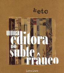
Era assim, respeitando a obsessão estalinista com os planos quinquenais, que a editora checa Svoboda apresentava (retrospectivamente) o seu catálogo para os 5 primeiros anos do pós-Guerra. Não se trata de um folheto, ou de um pequeno volume em octavo: são 220 páginas de texto em corpo reduzido (distribuído por 6 famílias de fontes, escrupulosamente creditadas no fim: Goudy, Gill, Plantin, Baskerville, Bodoni e Horley), em capa dura de pano creme impresso a vermelho e com sobrecapa. Além dos temas e autores “obrigatórios” num país sob o manto de Estaline (Marx, Engels e Lenine), e de todos os autores soviéticos que pudessem publicar, ainda se podem encontrar livros de Mickiewicz, Wasilewska, Jack London ou Jorge Amado. Uma lista cautelosa e segura em tempos de aço, apresentada de uma forma gráfica soberba que parecia dizer uma coisa: apesar das humilhações de duas anexações militares e de indizíveis horrores, a produção de livros continuava a ser levada muito a sério na Checoslováquia. E ao leme estava um tipógrafo de 40 anos, cuja experiência no design de livros se estendia a mais de uma década, e que, anos mais tarde e no auge da carreira, iria romper as barreiras da cortina de ferro, conseguindo o feito admirável de ser publicado em Inglaterra e nos EUA em plena Guerra Fria. O seu nome era Oldrich Hlavsa.


O livro é um objecto algo estranho, diria híbrido: por um lado, são óbvias as referências à vanguarda checa dos anos 20 e 30, de Teige, Sutnar ou Styrsky, sobretudo na fusão fluida entre a fotografia e a tipografia ou os elementos gráficos a 2 dimensões (como na bela capa, ou na página de rosto, com a fotografia de um conjunto de caracteres metálicos sobre fundo vermelho uniforme e o nome da editora em sans serif de caixa baixa); por outro, o peso “estalinista” (a foto de Estaline está logo na página 23, depois da de Lenine) impõe uma secura formal que Hlavsa vai conseguindo, aqui e ali, contrariar (em algumas páginas ímpares usando ou fotos a 4 cores dos livros na vertical, seguindo o mote da capa – revelando belíssimas capas, não sei se suas – ou então reproduções a uma escala real do design dessas mesmas capas). Mais do que na óbvia tentativa de marcar as diferentes secções com uma variação tipográfica mais ou menos aproximada ao “tema” de cada uma (por exemplo, compondo toda a secção dedicada a Mayakovsky com a única fonte não serifada do livro, a Gill), é no brilho dessas amostras ímpares que está já um relance do que Hlavsa iria fazer nos anos 60 e 70: paleta reduzida, composição cuidada dos elementos no plano, uso generoso e equilibrado do espaço branco, espaçamento e entrelinhamento irrepreensível das linhas de texto em caixa alta (a fazer lembrar o que Jan Tschichold preconizava e praticava na Penguin por esses mesmos anos) e, em primeiro plano, um detalhe tipográfico mais expressivo (ou até em articulação com uma ilustração) mas em perfeita harmonia com essa base mais sólida.


O percurso dele é tanto mais espantoso quanto, partindo da sua actividade de tipógrafo e sem formação académica teórica ou prática, e apesar do rígido e burocrático formalismo da sociedade checa durante o Estalinismo, conseguiu o feito (único para qualquer designer atrás da Cortina de Ferro, e no pico da Guerra Fria) de ter o seu “manual” de preceitos tipográficos Typografická písma latinková (1957) publicado simultaneamente nos Estados Unidos e em Inglaterra em 1960, com o título A book of Type and Design.
A década do renascimento da cultura checa apanha-o, assim, no auge da carreira, e levando a sua capacidade de invenção de combinações tipográficas ao limite (partilhando o gosto checo da década pela tipografia expressionista, paralelo ao movimento “anti-suíço” emergente nos EUA com Lubalin, Glaser ou nas capas de Roy Kuhlman), torna-se na referência da nova geração que procura uma alternativa ao formalismo académico (que Hlavsa consegue também perfeitamente seguir e usar no seu trabalho): ele é, quase sozinho, o garante da espantosa variedade e qualidade no design de livros na Checoslováquia durante esses anos, o único país da Europa de Leste de então (talvez com a Polónia por perto, não por acaso também o outro país do “Pacto de Varsóvia” a fugir declaradamente ao espartilho do realismo socialista nas artes gráficas) a valorizar os formatos “não-nobres” – como as edições paperback ou de bolso – com design gráfico de topo (num ensaio valiosíssimo sobre a história do formato paperback, publicado em Essays in the History of Publishing, volume dedicado aos 250 anos da Longman em 1974, Hans Schmoller – o antigo director de arte da Penguin – apontava precisamente esse curioso paradoxo de a URSS, país oficialmente dirigido pela nata da classe operária, ter apenas tardiamente e sem ânimo ou criatividade adoptado o formato de bolso, afinal o mais barato e acessível às massas operárias mundiais).
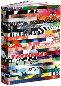
Foi certamente esse prestígio que permitiu a Hlavsa continuar a trabalhar durante o “período de normalização”, depois da invasão soviética de 1968 (um texto curioso sobre a prática do design nesse período, publicado na revista Typo &, pode ser lido aqui), coroando a sua carreira com algo que me parece ser único na história do design editorial, e sobretudo do design de livros: a publicação de 3 monumentais volumes monográficos (perto de 500 paginas cada um), entre 1976 e 1983, documentando todo o seu labor até à data. Mil e quinhentas páginas de genialidade tipográfica concentrada… Trata-se de um corpus impressionante mas estranhamente (ou talvez não) esquivo (daí o título): na minha intensa pesquisa pelos alfarrabistas checos apenas encontrei o seu rasto (já vendido) ou a barreira da distância (venda exclusiva na Rep. Checa). É, apesar disso, tenho de o confessar, a descoberta recente que mais me fascinou, sobretudo depois de ver as fotos que Martin Pecina colocou (cruelmente…) no Flickr, e de que retirei algumas amostras.


Sobrevivendo à rigidez dogmática dos regimes políticos (Nazismo e Estalinismo) e das vanguardas artísticas (os modernismos de entre-guerras e, sobretudo, a nova onda modernista e minimalista do Estilo Internacional suíço), esquivando-se aos primeiros e retirando dos últimos o que lhe interessava (menos a obsessão com o design “serial”: com Hlavsa, o design estava ao serviço da individualidade de cada título e dos ritmos visuais das suas palavras) e conjugando-o com a sólida tradição e prática tipográfica, é bem possível que Oldrich Hlavsa tenha sido, no seu cantinho de Praga, o melhor designer de livros do século XX. E neste catálogo de editora, lançado no final da mais fria década desse mesmo século, estava já uma faísca dessa chama.
THE ELUSIVE MR. HLAVSA
It was in this way, in full Stalinist five-year-plan mode, that Czech publishing house Svoboda presented its catalogue for the first five post-war years. It’s not a small leaflet or a thin volume in octavo: this is a 220 page book, set in tightly compact text (shared by 6 font families, all duly credited: Goudy, Gill, Plantin, Baskerville, Bodoni and Horley), with a cream clothed hardback printed in red and covered by a dust jacket. Besides the mandatory themes and authors in a country under Stalin’s thumb (Marx, Engels, Lenin…and Stalin), and all the Soviet authors they could publish, one can still find books by Mickiewicz, Wasilewska, Jack London or Jorge Amado. A safe and cautious list in times of steel, put forward in a superb graphic object that appeared to be saying one thing: despite the humiliations of two consecutive military invasions and occupations and the ineffable horrors brought by them, book design and production was still a very serious matter in Czechoslovakia. At the helm was a 40 year old typographer whose experience in book design went back over a decade, and who would, years later, break the Iron Curtain and achieve the astounding feat of being published in England and the USA at the height of the Cold War. His name was Oldrich Hlavsa.
The book is a strange object, I should say almost hybrid: on one hand, the connections to the Czech avant garde of the 1920s and 30s (Teige, Sutnar or Styrky) are obvious, especially in the fluid fusion between photography and typography or 2D elements (as in the beautiful cover, or the title-page, with the photo of a set of metal typaces over a solid red background and the name of the publisher ir sans serif lowercase); on the other hand, the weight of Stalin’s shadow (his photo is the second one used inside, right after Lenin’s) enforces a certain formal dryness that Hlavsa manages to counterpoint here and there (in some odd pages he uses either full color photos of the books in vertical stand, taking the motto from the cover – and showing beautiful covers, his or not I’m not sure – or full scale reprocudctions of those covers’s design). More than in the obvious attempt to create a typographic modulation and variety, setting each section in a type font more or less close to its “theme” (for example, using Gill Sans to set the whole section dedicated to Mayakovsky, the only one in the book set in sans serif type), it’s really in the brilliance of those cover samples that we can find a glimpse of what Hlavsa was to produce in the 1960s and 70s: reduced color palette, careful composition of all the elements, generous and balanced use of white space, impeccable tracking, kerning and leading of the lines if uppercased text (much in the way Jan Tschichold was advocating and putting to practice at Penguin in those years) and, at the forefront, expressive typographic details (or in connection with illustrations) in perfect harmony with that solid background.
Hlava’s career is all the more amazing considering that, despite having no formal practical or theoretical academic background beyond his experience as a typographer, and living in a society known for its bureaucratic rigidity, he managed the unique achievement for any type designer on the other side of the Iron Curtain (and at the very peak of the Cold War) of having his “manual” of type history and practice Typografická písma latinková (1957) published simultaneously in the USA and England in 1960, with the title A book of Type and Design.
The golden decade of Czech culture’s rebirth catched him, therefore, right at the very top of his professional path, and taking his ability of inventing typographic combinations to new limits (sharing the Czech taste for expressionist type solutions, on a par with the “anti-Swiss” movement emerging in the USA with Lubalin and Glaser or in the book covers of Roy Kuhlman) he became a reference to the new generation that was looking for an alternative to the academic formalism (which Hlavsa, ever the eclecticist, could perfectly well follow and incorporate in his work): he became, almost by himself, the warrantor of the amazing variety and quality in Czech’s book design during those years, in the Eastern Europe’s sole country (with Poland closely behind, not coincidentally the other country in the Warsaw Pact to deliberately escape the corset of Socialist Realism in graphic arts) to endow nobility upon the “poorer” book formats, such as pocket paperbacks, through top notch graphic design (in a quite informative essay on the history of paperbacks, published in Essays in the History of Publishing, a volume dedicated to the 250th aniversary of Longman’s in 1974, Hans Schnoller – the former art director at Penguin books – pointed precisely at that curious paradox of the USSR, officially ruled by the cream of the working class, having adopted the paperback format – after all, the cheapest and most accessible book to the wold’s working masses – only at a very late stage and without any real enthusiasm or creativity).
It was certainly this prestige that allowed Hlavsa to continue working during the “normalization period”, after the Soviet invasion of 1968 (a curious text on how it was to work in Czechoslovakia during those years can be found here, in the Typo& magazine website), crowning his career with something I believe to be unique in the annals of graphic design’s history, especially in book design: the publication of Typographia, a monumental 3-volume monograph (almost 500 pages in each volume), from 1976 to 1983, documenting all his work up until then. Fifteen hundred pages of concentrated typographic genius… It’s an impressive corpus by any standard, but strangely quite elusive now (hence the title): in my intensive research through the online Czech antikvariaty (used books shops) I only found its trace (having already been sold) or the distance barrier (being sold only within Czech Republic). In spite of that, I must admit that it is by far the discovery that has fascinated me the most in recent times, especially after seeing the photos of the books Martin Pecina (cruelly…) posted in his Flickr page, of which I took some samples.
Surviving the dogmatic rigidity of hardline political regimes (Nazism and Stalinism) and artistic vanguards (the Modernisms between the wars and, above all, the renewed modernist and minimalist wave of the International Swiss style of the 1950s), eluding the former ones and taking form the latter ones what interested him (minus the obsession with serial design: with Hlavsa, design was always at the service of each title’s individuality and its words’ visual rythms) and mixing it with the solid typographic practice and tradition, Oldrich Hlavsa may have been, in his little corner in old Prague, quite probably the best book designer in the 20th century. And in this early publisher’s catalog, produced in the last years of the coldest decade in that century, was already a spark of that later flame.
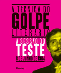


Pingback: Quinze anos de belos livros « Montag : by their covers : resgate do fogo